Before and After: Fixing a Tycoon UI for Mobile Players
Redesigning tycoon UIs to work with thumbs instead of cursors.

Try tapping a tiny upgrade button crammed into the corner of a phone screen while your thumb blocks the one number you actually needed to read. That moment happens a few hundred times a session, and it's the whole story of why tycoon games stumble on mobile. The root cause is a build process that starts on a large monitor, with a mouse and a cursor as the default input, and treats the phone as something to deal with later. Button sizes, spacing, and information density all get locked in around a precise pointer and a 24-inch screen, and none of that survives contact with a thumb and six inches of glass. Epic's own mobile design guidance for UEFN puts the failure in blunt terms: bad mobile controls are a gamepad layout translated into virtual buttons, a straight swap standing in for a real redesign. None of this means the tycoon genre is a bad fit for phones. You tap to collect, tap to upgrade, and watch the numbers climb, a loop that's practically made for a five-minute bus ride. The problem sits one layer up, in the interface placed on top of that loop, not in the loop itself.
The five specific ways a tycoon HUD fails mobile players
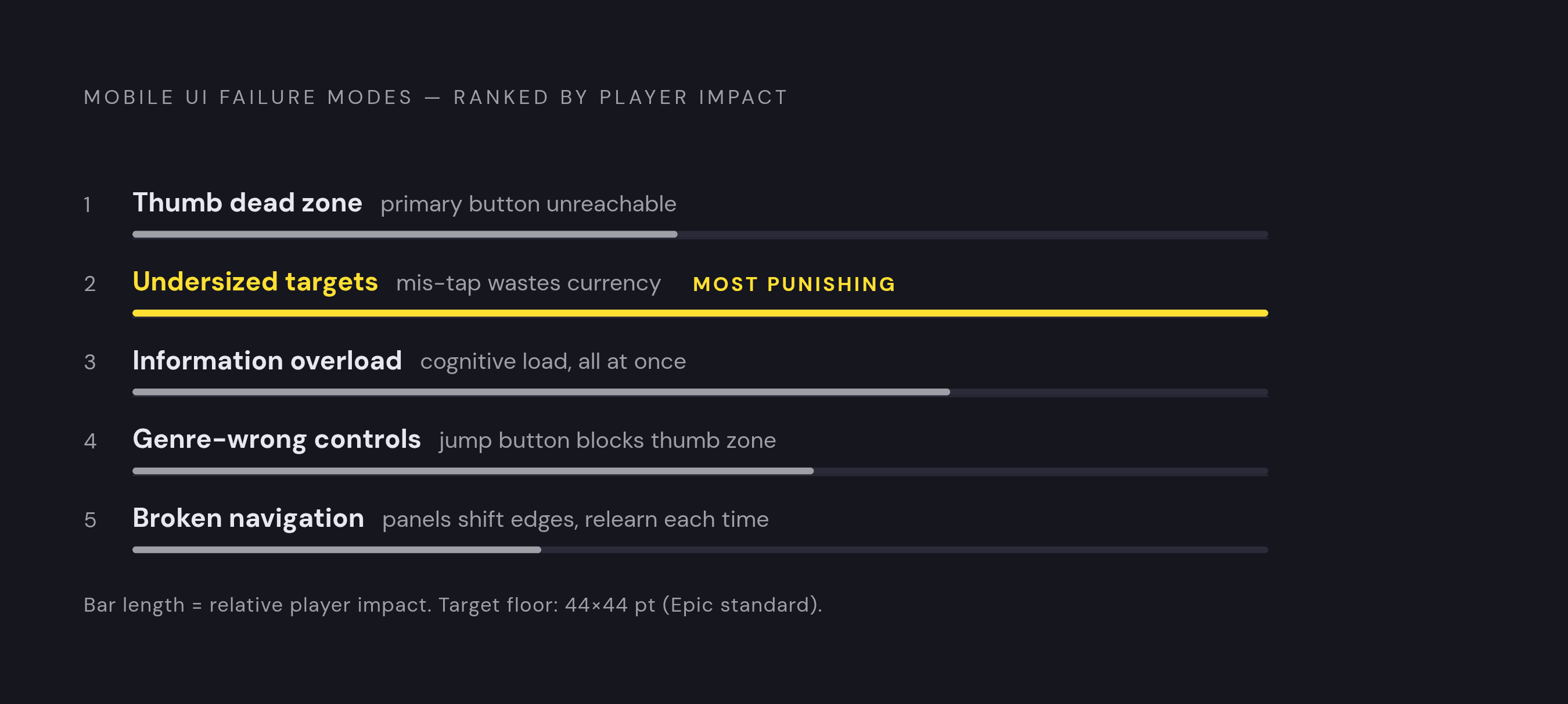
These five failures tend to show up together, and when a tycoon UI carries all five, it does more than feel clumsy to hold. It actively breaks the dopamine loop the genre runs on, because it buries the exact visual payoffs, the number popping up, the progress bar filling in, the building leveling up on screen, that make spending and earning feel good.
The first is the thumb dead zone problem. Most touch interaction happens with thumbs, and the top and center of the screen are the hardest places for a thumb to reach on anything bigger than a small phone. Put the main upgrade or buy button up there, and players shift their grip over and over just to hit it. Epic's own guidance points to the bottom corners as the natural home for primary actions, and reserves the top center for things players only need to glance at, like maps, timers, and scores.
The second is undersized touch targets. Epic's documentation sets a floor of 44×44 points for any tappable text or icon, and if the type drops below 18pt, it reads badly on a phone and invites mis-taps. In a tycoon game, a mis-tap wastes currency on the wrong upgrade, which is about as punishing as this genre gets.
The third is dumping too much information on screen at once. Showing every mechanic simultaneously is a habit left over from desktop layouts, where there was always room for one more panel. Appnality's technical UI/UX guide calls a cluttered HUD a major source of cognitive load, and points to "contextual minimalism" as the fix: show only what's needed, only when it's needed.
The fourth and fifth both involve clutter of a different kind: leftover controls and broken consistency. Epic's guidance makes the genre point directly: a tycoon game doesn't need a jump button, so any inappropriate control left on screen eats into the thumb-zone space the real buttons need. Pair that with navigation that shifts from screen to screen (a panel that opens from the left on one page and the right on another) and players end up relearning the interface every time they switch context, instead of building the kind of muscle memory that makes a mobile game feel smooth.
Before and after: moving the primary action button into thumb reach
Picture the typical setup: the buy or upgrade button sits dead center or in the upper half of the screen, because that's where it landed during desktop layout work. On a monitor, that placement looks confident and easy to find. On a phone bigger than a few inches, it means a grip shift or a second hand just to tap the one button a player hits most often.
The fix moves that button, whatever action the player repeats most in the core loop, down into the bottom portion of the screen, where a thumb naturally rests and swings. Picture a buy button parked in the bottom-right corner and a currency balance sitting quietly in the top bar: one lives where the thumb works, the other lives where the eye glances. Secondary information shifts upward, still visible, just no longer competing for touch space it never needed.
Epic's mobile design documentation is specific here: primary action buttons need to sit within easy reach of an average thumb, and a well-built HUD should expand and collapse based on what the player is actually doing in the moment. For a tycoon game, that means you get a purchase button that's always within reach and an upgrade panel that opens only when called for. Nothing gets cut from the game in this fix. The currency display, the income meter, the upgrade panel, all of it stays. It just moves to where it costs the player the least effort to use.
Before and after: replacing an always-on upgrade panel with progressive disclosure
A familiar before state looks like this: a full upgrade panel sitting on screen at all times, listing every building, every stat boost, every income multiplier at once, because the goal was to let players see all their options up front. That choice feels generous on a 24-inch monitor, which has room to spare. On a 6-inch phone, it reads as a wall of boxes competing for the same six inches of glass.
The fix is a single persistent icon or button that opens the upgrade panel when the player wants it. While it's closed, the screen holds only three things: the currency counter, the income ticker, and the main earn action, the three pieces a player actually needs to keep the loop going without interruption.
Treat hiding and organizing as two different acts here, because they are. Hiding information means a player can't get to it. Organizing access means the same information sits one tap away instead of permanently in view, and the numbers players check constantly, their balance, their income rate, never disappear. Appnality's guide calls this "contextual minimalism" and gives a clean example: a health bar doesn't need a numeric percentage glued to it at all times, and an ammo count can wait to appear until it's relevant. The tycoon version of that rule is an upgrade panel that surfaces when a player has enough currency to actually act, not one sitting open the whole time whether there's a decision to make or not. The same guide treats this kind of staged reveal as the backbone of good onboarding, too: introduce mechanics and interface pieces one at a time, right as the player needs them, a rule that holds for a player's very first session and for the five-hundredth one just as well.
Mid-core tycoon players who like dense interfaces and bristle at anything that feels hidden have a fair complaint, and it deserves a direct answer. Progressive disclosure doesn't take information away. It organizes when that information appears: the panel is always one tap away rather than gone, and the numbers that matter most stay on screen the entire time.
Before and after: making touch targets and contrast pass a one-thumb test
Run this as a literal checklist, start to finish, in an afternoon. Start with sizing. In the before state, upgrade buttons get scaled for cursor precision and text labels sit below the readable threshold, so players mis-tap and accidentally trigger the wrong purchase, a brutal failure in a genre built entirely around spending currency in the right place at the right time. The fix applies Epic's documented floor directly: 44×44 points minimum for any tappable element, with every button label at 18pt or larger. None of this needs new artwork. It's a resizing pass on assets that already exist.
Contrast gets the same treatment. The before state has upgrade buttons, background panels, currency icons, and income meters all painted in a similar color family, which looks cohesive on a large monitor and turns muddy and hard to parse on a phone screen in daylight or mixed lighting. AAA Game Art Studio's guide treats proper color contrast as a foundational UX principle: colors that contrast well don't strain a player's eyes. Epic's own guidance adds a use case desktop design never has to think about: high-contrast UI has to hold up in direct sunlight, because phones get used outdoors and monitors mostly don't.
The fix is just as concrete. Pick one high-contrast accent color and reserve it exclusively for the primary action, the buy or upgrade button. Keep panel backgrounds neutral or dark. Make sure the currency counter sits against a backing dark or light enough that nobody has to squint to read their own balance. Appnality frames the whole point of a HUD as delivering critical information quickly and clearly without blocking the player's view of the game itself, and contrast is what actually makes that speed real. Sizing and contrast together are the cheapest, most visible wins on this entire list, no new systems, no new art direction, just measurements and color choices brought up to a standard built for a thumb and a screen outdoors.
Before and after: stripping genre-inappropriate controls and fixing navigation consistency
The before state here often comes from a template: a tycoon layout that still carries a jump button, a sprint toggle, or some other holdover built for a different genre. Those controls sit in the exact thumb-zone real estate the upgrade and purchase buttons need, and worse, they tell the player, without a word, that this interface wasn't actually built for the game they're playing.
Epic's documentation makes the fix a genre-specific rule rather than a style preference: controls should adapt to the game, and a tycoon game doesn't need a jump button. Cutting a control that doesn't belong isn't trimming for the sake of trimming. It frees up space for the handful of buttons that actually carry the game. The after state keeps the visible control set to what the loop requires: a collect or earn trigger if the game uses manual taps, an upgrade panel button, and access to settings or pause, landing at five or six active controls on screen at most, which lines up with Epic's own HUD recommendations.
Navigation gets the same cleanup. The before state has the upgrade panel opening from one corner on the main screen but sliding in from the opposite edge in the shop, a back button that moves position between sessions, and menu depth that runs past two levels. Every one of those inconsistencies forces a player to relearn the interface each time they switch screens, which is exhausting in a genre meant to be played in short, repeated bursts. The fix anchors every persistent control, the currency display, the upgrade access point, the settings icon, to the same spot on screen across every view in the game, so a player's muscle memory carries over. None of the five fixes across this piece removed a feature from the game. Each one changed where that feature lives on screen and when it shows up, which is the entire difference between a mobile UI that merely functions and one that was actually designed with a thumb in mind.
Applying these fixes without rebuilding your game from scratch
All five fixes here are surface-level changes, not architecture. Repositioning buttons into the thumb zone, adding a progressive-disclosure panel, resizing touch targets, adjusting contrast, and cutting unnecessary controls, none of it touches the game's economy or its progression systems underneath. You can run this full audit against a live game without rewriting a single formula that governs how currency or upgrades work.
Appnality's guide makes a point of treating UI and UX as structural parts of a game rather than decoration bolted on at the end, and the practical reading of that for anyone with a game already live is simple: run the five-point audit in this piece before the next update ships, rather than waiting for some future full rebuild that may never happen. Epic's own mobile documentation pushes the same instinct from a different angle: it recommends fast, small prototypes to test whether a mechanic actually works on mobile before any polish gets added, and that workflow fits UI changes on an existing game just as well as it fits a brand-new one.
If you're building a tycoon game from the ground up rather than patching one already in players' hands, you can bake these same five principles in from the first layout sketch. Tools like studs.gg, built for creating games with AI assistance, give creators a path to start with mobile-first placement, sizing, and disclosure patterns already in place, rather than designing for a monitor first and only discovering months later that thumbs block the screen's reachable zones. Whether the work is fixing a game that's already live or starting one from scratch, the underlying point holds steady: mobile UI quality is something a creator can directly control, and the five fixes covered here, thumb-zone placement, progressive disclosure, touch-target sizing, contrast, and control pruning, are the places where that effort pays off fastest.